柱状图
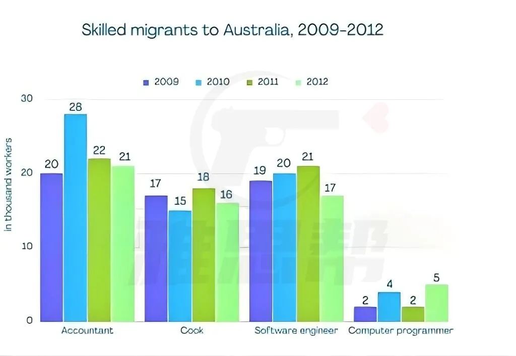
The chart below gives information on the number of workers in different occupations who migrated to Australia between 2009 and 2012.
1、题目大意
下图显示了2009年至2012年间移民到澳大利亚的不同职业的工人人数。
2、高分范文示例
开始段 - 改写题目+趋势描述:
The provided bar chart illustrates the influx of workers in four distinct occupations migrating to Australia from 2009 to 2012. Overall, the Accountant occupation had the highest number of migrants during the specified period, in stark contrast to Computer Programmers who had the lowest figures. The numbers for Accountants and Computer Programmers showed an upward and downward trend respectively over the years, while Cooks and Software Engineers experienced fluctuations in their migration numbers.
主体段-1:描述人数最多的会计和最少的计算机
Accountants saw a significant increase in migration from 20 thousand in 2009 to a peak of 28 thousand in 2010, which then declined to 18 thousand by 2012. Conversely, Computer Programmers had the lowest migration numbers starting at 2 thousand in 2009, slightly increasing to 4 thousand in 2010, and then slightly decreasing to 2 thousand in 2012.
主体段-2:描述中间两个职业
Cooks started with 21 thousand migrants in 2009, saw a drop to 15 thousand in 2011, and ended at 16 thousand in 2012. Software Engineers had 20 thousand migrants in 2009, rose to 21 thousand in 2010, but decreased to 19 thousand by 2012, showing a slightly fluctuating trend over the period.
高分语料
显著增加 significant increase
达到峰值/达到顶峰 peak at
略微增加 slightly increase
略微下降 slightly decrease
大幅下降 decline sharply
经历波动 experience fluctuations
保持在...水平 remain at (a certain level)
呈上升趋势 show an upward trend
呈下降趋势 show a downward trend
触底 hit a low / reach the lowest point


